I’ve been thinking recently about how and where I share information and particularly how many of those applications and websites share with each other. There are of course a huge number of websites and applications on the Internet today that deal with user generated content. I participate in a decent amount of them myself.
Some of them I directly upload to (primary sharing). Others have information pushed to them from the ones I deal with directly (secondary sharing). Many are both primary and secondary, depending on the content being shared. To make things a touch more confusing, some of the secondary sharing is automatic and some is manual and when manual, it is sometimes an opt-out and sometimes an opt-in to share. The end result is basically a personal content distribution network, custom tailored to my own preferences.
Knowing what I do about many of my friends, family, colleagues and associates; I must assume that a fairly large (and growing) number of folks in the Internet connected world have similar personal content networks which are tuned to their own views and attitudes towards public information sharing. I also assume that much of this is happening subconsciously.
In order to better understand the flow of information within my own personal content network, and make my cultivation of it more conscious, I built the chart which is included here (click on it for full resolution):
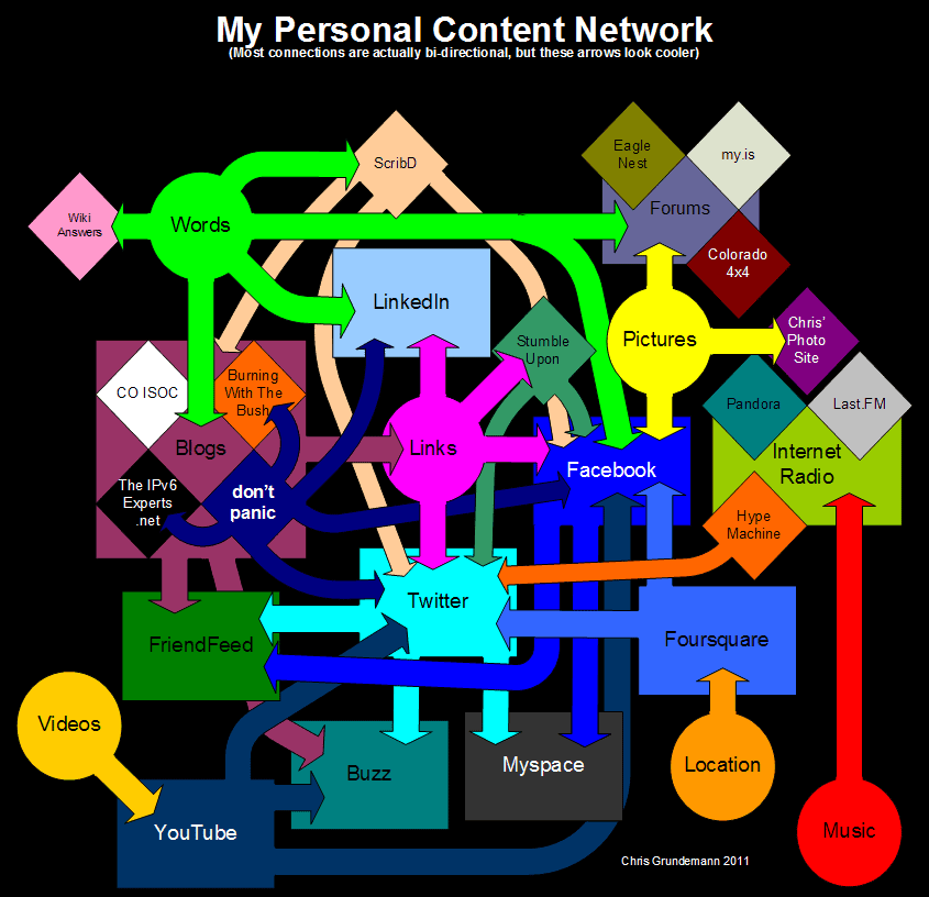
Here you can see various content types represented by circles. Major sites, applications and types of sites are seen as rectangles and some individual sites and applications are shown as diamonds. Arrows obviously indicate the sharing of information. In general, arrows from a circle indicate primary sharing and arrows connecting applications and websites represent secondary sharing. There is however no explicit segregation between primary and secondary sharing and no indication whatsoever of automatic or manual secondary sharing. The colors are fairly random and were chosen simply to help with visual clarity. There are definitely some oversights and likely some mistakes as well; for example, words should probably connect directly to Facebook, etc…
One of the first things I realized while building this chart is that although it was intended to track the content that I create and/or share, it also does a great job of illustrating how and where I consume content. This epiphany is the cause for it’s subtitle: Most connections are actually bi-directional, but these arrows look cooler.
The relationship is not one of direct parity between creation and consumption though. For example; although Buzz, Myspace and Friendfeed receive secondary (perhaps I should more accurately label it tertiary in many circumstances) content from me, I very rarely consume any content there. Likewise but in reverse, I consume lot’s of music and many videos but rarely upload my own. Also, some of the content I share is created by me and some is not. The posts here on my blog are almost exclusively content created by me while the documents I upload to ScribD are very often not.
Anyway, the chart has definitely helped me organize my thoughts about personal content networks and has also raised a lot of new questions. I hope it is thought provoking for you as well.
At some point I think I’d like to revisit this and:
- Track which sites I continue to use in the future.
- Display content consumption more directly.
- Rectify all oversights and mistakes that I made in this version.
So… What did I miss? Where are the mistakes? How can I improve this chart?
I am also extremely interested in hearing about your own personal content network; whether you think you have one, how intentionally you have created and tuned it, how much you consume vs create, and any other thoughts you may have on the subject. Please feel free to leave me a comment here on my blog, or on any of the other platforms that we share!